

Select options
This product has multiple variants. The options may be chosen on the product page


Select options
This product has multiple variants. The options may be chosen on the product page
Select options
This product has multiple variants. The options may be chosen on the product page
Select options
This product has multiple variants. The options may be chosen on the product page
Select options
This product has multiple variants. The options may be chosen on the product page
Select options
This product has multiple variants. The options may be chosen on the product page
Select options
This product has multiple variants. The options may be chosen on the product page
Select options
This product has multiple variants. The options may be chosen on the product page
Select options
This product has multiple variants. The options may be chosen on the product page
Select options
This product has multiple variants. The options may be chosen on the product page
Select options
This product has multiple variants. The options may be chosen on the product page
Select options
This product has multiple variants. The options may be chosen on the product page
Select options
This product has multiple variants. The options may be chosen on the product page

Select options
This product has multiple variants. The options may be chosen on the product page
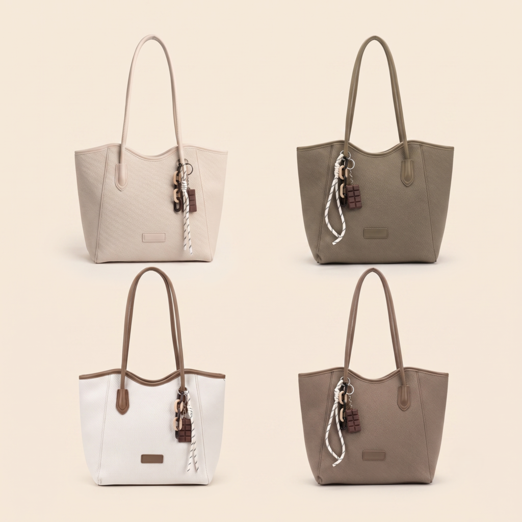
Select options
This product has multiple variants. The options may be chosen on the product page